By Mary Anne Patton
I’m trying to convince myself to sign up for a new, tubed insulin pump through my private health insurance as I haven’t had a new pump for over 9 years. But something is holding me back and it’s got nothing to do with glycemic outcomes.
It’s the user interface, device status tracking and interaction features of the open source systems I’ve been using that are just so helpful, it is hard to give them up. I’ve used openAPS, AndroidAPS, Loop and Trio since May 2018.
In this blog post I’ll outline a few of the main usability features I’ve appreciated in the hope that developers of commercial systems might incorporate them too.
In-app diabetes dashboard, AndroidAPS
The super helpful ‘status lights’ feature in AndroidAPS seems to have been modelled on Nightscout. It lets the user effortlessly, ‘at a glance’, keep track of the status of all their diabetes devices right on the main screen, in a way that is more helpful than any commercial app I’ve seen.
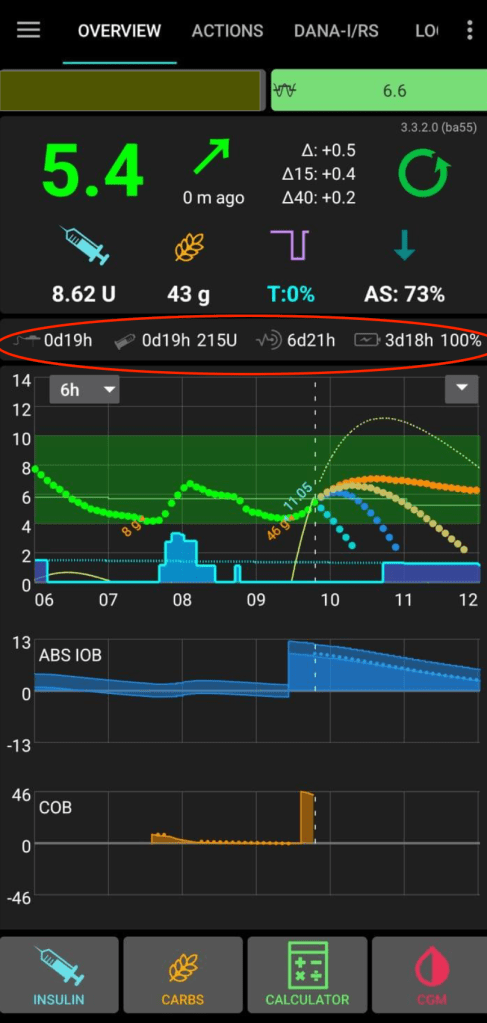
As you can see from the above image, the status lights (circled in red) show the number of days and hours since last:
- Pump site change
- Pump reservoir/cartridge change
- CGM sensor start
- Pump battery change
- Pump battery charge remaining (as a percentage)

The user can configure each status icon to change colour at the time threshold of their choice. When using AndroidAPS I configured mine to turn red once the threshold was reached after three days on a pump site, six days after a reservoir change, 14 days after a CGM sensor change, or after 30 days on a pump battery. The colour change capability meant I could just ignore these tiny icons most of the time, with the reassurance of knowing that when something needed attention it would turn red and I could make the change at the next convenient moment. (Note, yellow/amber option for people who like an earlier nudge too, is also available)
This might not seem like rocket science, and it isn’t, but compare it with the way device status is displayed in most diabetes apps.
A lighter cognitive load
It might be argued that this type of information is already available in Automated Insulin Delivery apps and other diabetes apps, however it is usually displayed as ‘time and date inserted’ or ‘time and date of expiry’. This causes the user to have to calculate the time between ‘now’ and the time that the change is required, possibly by consulting a calendar, and the user also risks being ambushed by an intrusive, inconvenient alert that their device needs attention, rather than a visual nudge that they are in control of. Most diabetes apps also force the user to dig down through a few screens to get to the information, rather than having the information easily available ‘at a glance’ on the app home screen.
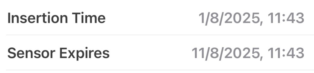
Having configurable colour-changing device status icons on the home screen relieves me of the device tracking burden, whereas ‘insertion time and expiry date’ style device tracking requires effort eg to check when an upcoming site change might be required.

Contextualising experience
The AndroidAPS status icons can also be useful for validating glycemic experiences, eg if my BGs have been persistently drifting higher than usual, I might glance and notice that it is day 4 of an infusion site, which might indicate that the site is beginning to fail and a change is needed. Or it might indicate that I’m eg in the first 24 hours of a new CGM sensor or near the end of the usual CGM sensor lifespan, so the jumpiness I’m seeing is possibly linked to that. Having the device status information so easily visible helps inform the user about what action will likely help.
‘Live Activities’ on iOS Lock Screen
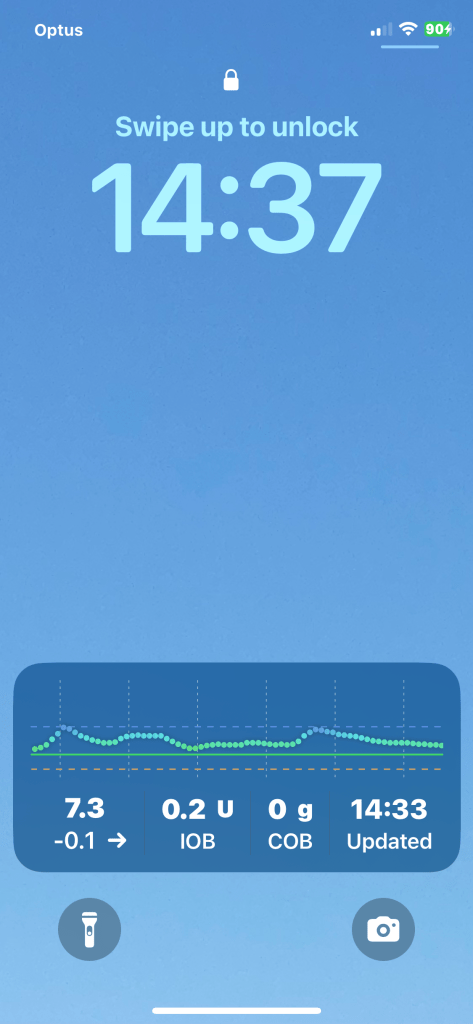
One of the features I’ve loved with my current AID system, Trio, is the ability to see glucose, insulin and algorithm info via Live Activities on the iPhone Lock Screen. This enables me to check where things are at ‘on the fly’ without needing to open the Trio app. Users can choose from a number of options to control which types of data are displayed here. Just a couple of examples of how this Live Activities information can be useful are knowing whether to eat carbs prior to exercise due to the amount of insulin on board (IOB) and getting a feel for whether or not you might go low soon given current BG, glucose trend, Carbs on Board and IOB.
Data on your watch
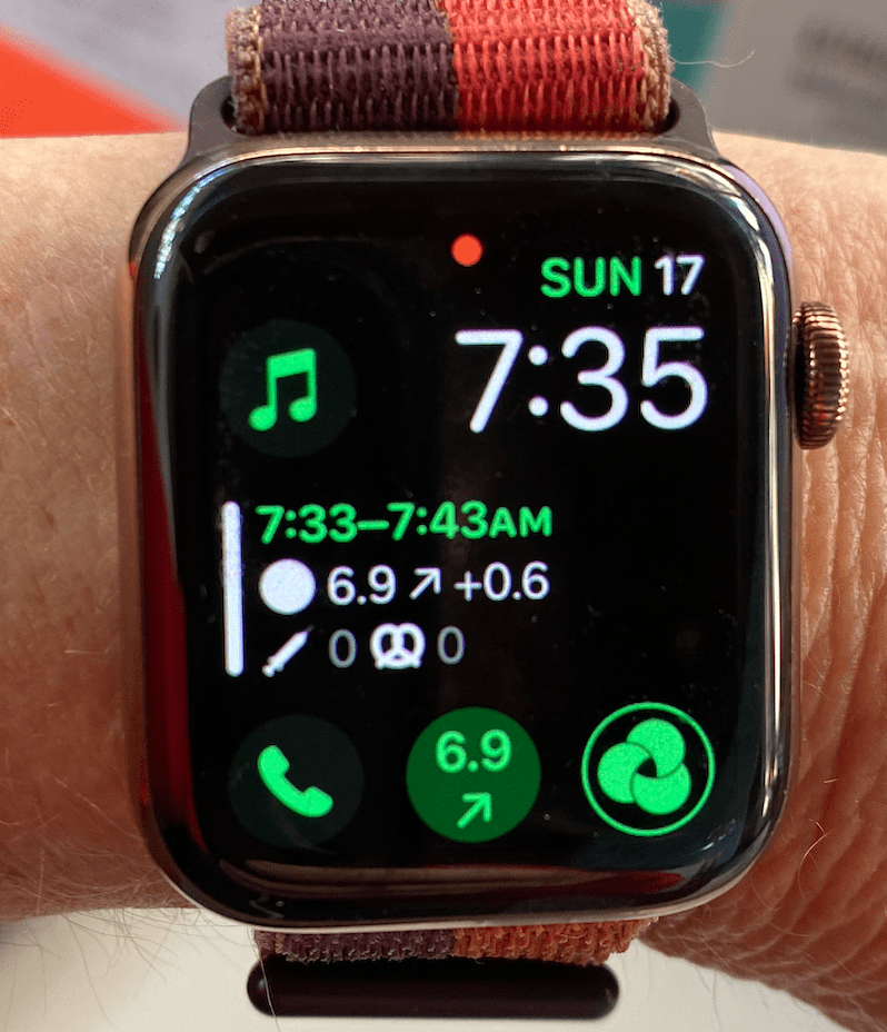
Being able to glance at my smartwatch and check where my blood glucose is at feels absolutely critical to my quality of life these days. In fact, knowing glucose and IOB at any point in time is so useful that I believe an ‘at a glance’ display should be a bare minimum requirement for any new AID system coming to market. Being able to glance at a watch rather than pulling out a phone to open an app is especially important for anyone working in an overtly smart phone free workplace (eg many schools and yes I know there are medical exemptions), being in an environment or social situation where discretion is important to the user and for people with fear of hypoglycaemia.

the +0.6mmol/L recent glucose increase is very useful to me
One of the commercial insulin pump/AID systems I am thinking of changing to has some fantastic advantages. The pump is small and lightweight, and works with an advanced machine learning AID algorithm. However for anyone using it off the shelf it has no watch app and no ability for the user to see their BG/CGM readings on their watch. If I end up switching to this system I will probably set up an open source workaround to get glucose readings onto my watch. It will be less straightforward, will require internet and is something that is probably out of reach for many users. It may even end up being a deal-breaker for me which is disappointing. I wish this company well and hope they are able to get a glucose to the watch feature sorted soon.
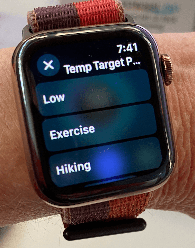
Of course, open source AID systems can also be interacted with via the watch controlling the phone app, eg allowing the user to enter carbs, bolus, set temp targets etc. I don’t use this functionality much currently, as I prefer the main phone app for these functions, but it is fantastic to have access to these innovations.

I hope commercial AID companies continue to innovate in this space too and that they are able to bring even more useful AID data and interaction options onto smartwatches in the near future.
Meal handling flexibility
With all the open source AID systems the user has the flexibility to handle meals in the way that suits them, rather than being forced through a meal bolus workflow. So for example, someone might enter carbs and bolus the insulin for a whole meal for breakfast, announce all carbs but only bolus half the insulin at lunch time, leaving the algorithm to handle the rest, and not bother announcing anything at all in the evening, leaving it all to the algorithm. Maybe they just set an Eating Soon temp target.
The user can also just give a bolus and not announce any carbs to the system. This is apparently not possible with all commercial AID systems. A friend of mine, who uses a popular system that works reasonably well for her glycemic outcomes, says it annoys her that her app won’t allow her to give a bolus without a meal, in order to give a correction bolus. This leads her into entering ‘fake carbs’. It would be good for commercial apps to allow more flexibility for these interactions.
And yes, plenty of people are finding ways to successfully use their loops as Fully Closed Loops, with faster insulins, adjunct therapies and modified algorithms and it will be interesting to see if that makes its way into the commercial realm and how it ends up being implemented.
iOS Shortcuts

A few years ago now, I wrote about using iPhone shortcuts in conjunction with the Easy Bolus features of my old Medtronic pump to handle meals and set temp targets. Although I don’t use it now as I no longer use openAPS, this quick style of user-defined, meaningful interaction remains my favourite so far. It was a colourful swipe, tap, tap and meant less time on diabetes screens and more time on life.
What next…
Stay tuned… if I do go to a commercial system I’ll write a post about the pros and cons, and whether or not I used additional apps including open source solutions to make the user interface work better for me. But writing this post has reminded me of just how much I appreciate the usability features I’ve mentioned and it would be nice to have the option of continuing to open source loop with a new tubed insulin pump. So if a commercial pump company decides to allow open source AID algorithms to be used with it, as an option in addition to their own AID algorithm, I will be delighted too.
Cite this article:
Patton, Mary Anne (2025) “What’s missing from commercial AID loops?” My Artificial Pancreas. <https://myartificialpancreas.net/2025/08/18/whats-missing-from-commercial-aid-loops/>
